Website design — a complete, honest guide
A quick note for anyone who found this page searching in Hindi (वेबसाइट डिज़ाइनिंग क्या है, roughly "what is website designing"): the answer is the same one above — website design covers how a site looks, how it's organised, and how visitors move through it, distinct from development, which is the coding that makes it work. We work with businesses across India in both English and Hindi during project conversations, even though our published content here is in English.
Website design terms, explained in plain language
A short glossary, because a lot of confusion in early client conversations comes down to jargon used inconsistently, not genuine disagreement about what's needed. These are the terms that come up most often, defined the way we'd actually explain them out loud:
| Term | What it actually means |
|---|---|
| Wireframe | A bare-bones layout sketch — boxes and labels, no colour or real styling — used to settle structure before visual design begins. |
| Mockup | A realistic, styled preview of a page — colours, fonts, real or placeholder content — that shows roughly what the finished page will look like, without being functional yet. |
| Responsive design | A layout that automatically adjusts to fit different screen sizes, from desktop monitors down to phones. |
| UI (user interface) | The visual layer of a site — colour, typography, buttons, icons, spacing. |
| UX (user experience) | How a site actually works for the person using it — ease of navigation, clarity, how many steps it takes to complete something. |
| CMS (content management system) | Software (like WordPress) that lets someone update a site's content without editing code directly. |
| Landing page | A standalone page, often built for a specific campaign or offer, designed around one clear action rather than general site navigation. |
| Above the fold | The part of a page visible without scrolling — the first impression a visitor gets before they decide to keep reading. |
| Favicon | The small icon shown in a browser tab, next to a page's title. |
| Hero section | The large, prominent area at the top of a homepage — usually a headline, short description, and a primary call to action. |
Have a term we haven't covered? Ask us →
UI and UX — two different jobs that both sit inside "design"
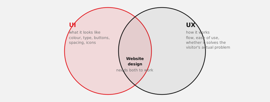
This is one of the most commonly confused pairs of terms in the industry, and it's worth untangling properly because the difference actually changes what you should expect from a design project. UI (user interface) design is concerned with what a page looks like — colour, typography, spacing, icons, buttons, the visual system that makes a site recognisably yours. UX (user experience) design is concerned with how a site works — whether a visitor can find what they came for, how many steps it takes to enquire or buy something, whether the whole thing feels effortless or like a small fight.
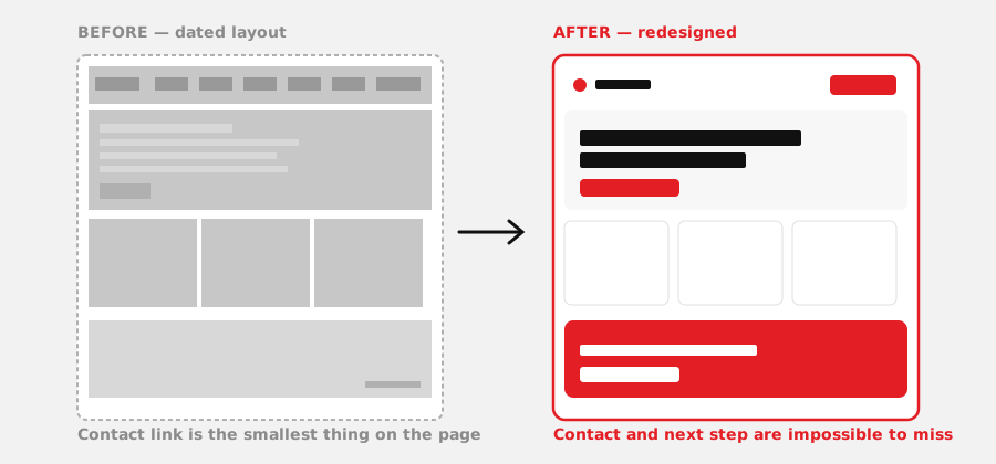
A site can have excellent UI and poor UX: beautiful colours and type, but a contact form buried three clicks deep, or a mobile menu that's technically there but genuinely hard to tap accurately. The reverse is also possible, though rarer in practice — a site that's easy to use but visually forgettable. A properly designed website needs both working together, not one compensating for the other.
For a deeper, research-driven explanation of the same distinction, Nielsen Norman Group — a usability research organisation that has been studying how people actually use websites since the 1990s, and has no commercial stake in selling design services — has a short, direct explainer worth watching before you brief any designer, agency, or freelancer:
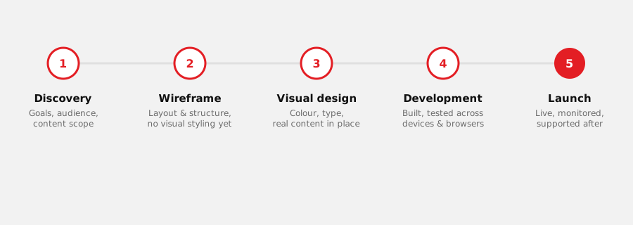
- Wireframing — a bare-bones layout sketch that settles structure before any colour or styling is applied, so structural problems get caught early and cheaply
- User flow mapping — the specific path a visitor takes from landing on a page to completing an action (enquiring, buying, booking)
- Visual/UI design — colour, typography, spacing, and imagery applied once the structure is settled
- Testing across real devices — because a layout that looks right on a designer's laptop screen can behave differently on a mid-range Android phone, which is what most Indian visitors are actually using
See how our design process works →
The parts of a homepage that actually carry weight
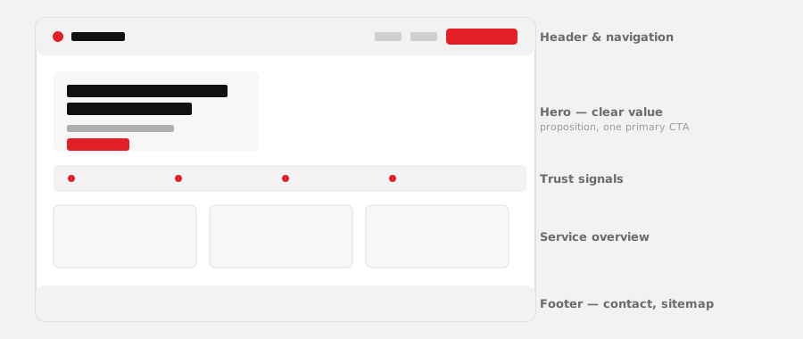
Most visitors decide within a few seconds whether to keep reading or leave, and that decision happens almost entirely in the first screen — before any scrolling. That's why the hero section (the top of the homepage) gets a disproportionate amount of design attention: a clear headline stating what you do, one obvious next step, and enough visual confidence that the site doesn't read as an afterthought.
Below that, a trust strip does quiet but important work — a line about how long you've been in business, a few client names or logos if you have permission to show them, anything that answers the unspoken question "can I trust this business?" before a visitor has to ask it. Then comes the actual content: what you do, laid out clearly enough that someone doesn't have to hunt for it.
Beyond the homepage, the pages that matter most vary by business type, but a few patterns hold across most of the sites we design:
- A real "About" or credibility section — even a short one does more trust-building work than most businesses expect
- Service or product pages that answer real questions — pricing signals, what's included, how to get started — not just a paragraph of description
- A contact path that's never more than one click away — phone, WhatsApp, and a form, not buried in a menu
- Mobile-first layout — most visitors to a business site in India are on a phone, not a desktop, and design decisions should start from that fact, not treat it as an afterthought
See real homepages we've designed →
Not every website needs to do the same job
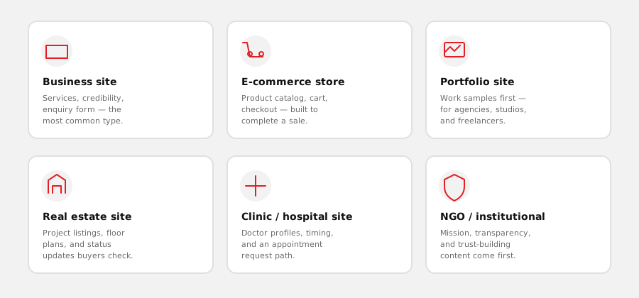
A common mistake in early conversations about a new website is treating "website design" as one single product with one single shape. It isn't. A business website whose main job is generating enquiries is a different design problem from an e-commerce store whose job is completing sales, which is different again from a portfolio site whose job is making finished work look good, or a real estate site where visitors mostly want project status and floor plans without calling anyone first.
The design decisions that follow — what goes in the header, what the homepage leads with, how deep the navigation goes — change based on which of these a site actually is. Getting this wrong early is one of the most common reasons a finished website ends up not converting well: it was designed as a generic "business website" without ever pinning down what specific job it needed to do.
| Website type | What it needs to get right |
|---|---|
| Business / service site | Clear service explanation, credibility signals, a fast path to enquiry |
| E-commerce store | Browsable catalog, honest stock status, a low-friction checkout |
| Portfolio site | Work samples front and centre — everything else is secondary |
| Real estate site | Project listings, floor plans, and status updates buyers check often |
| Clinic / hospital site | Doctor profiles, timings, and a simple appointment request path |
| NGO / institutional site | Transparency and mission content that builds trust before any ask |
Tell us what your site needs to do →
What this looks like across real industries
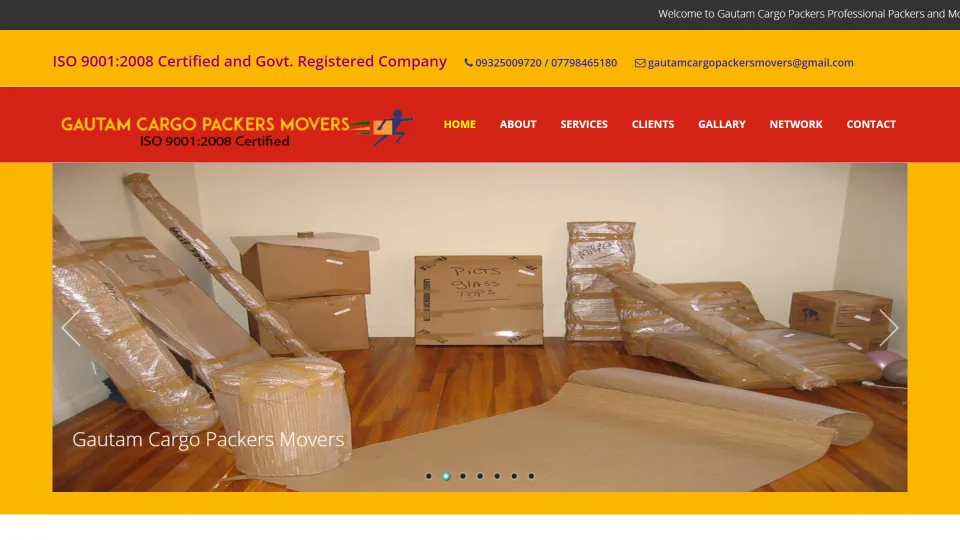
Rather than describe website types in the abstract, it's more useful to point at real, different businesses we've actually designed for, because the differences between them are exactly the point being made above. Gautam Cargo Packers & Movers, a logistics business, needed a site built around service-area clarity and lead capture, with SEO handled by the same team — a very different design problem from Hotel 7 Rays, a hospitality business where the design job is mostly about visual appeal and an easy booking enquiry path.
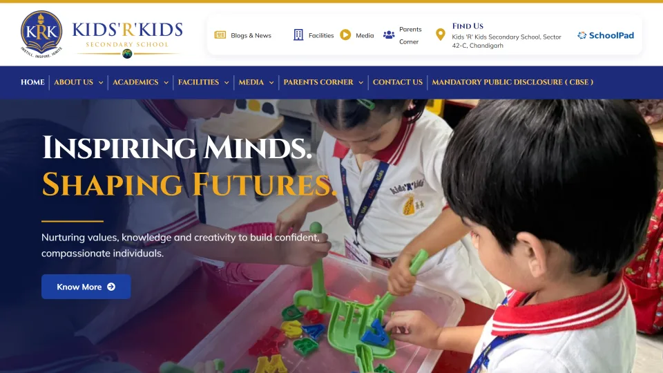
Kids'R'Kids Secondary School needed a CBSE school website structured around admissions information and institutional trust, for a Chandigarh-based client we've never met in person. Earthacers Landmark, a real estate business, needed a bilingual site structured around live project status, because that's what buyers actually check repeatedly during a purchase decision. None of these would have worked well built from the same generic template — the design decisions genuinely followed from what each business needed the site to do.
E-commerce website design, specifically
E-commerce gets its own mention here because it's different enough from a regular business site to deserve a separate word. Drop any product catalog into a generic online-store theme and technically you have a store — a homepage, some product cards, a cart icon in the corner. What you often don't have is a store that actually converts a browser into a buyer, and that gap is almost never a technology problem. It's a design problem, and it comes down to a small, repeatable set of mistakes: too many steps between "I like this" and "I paid for this," product pages that answer questions the seller cares about instead of the ones the buyer is actually asking, and a checkout that was clearly designed on a laptop and shrunk down as an afterthought.
Product and category pages matter more than the homepage for a store, because that's where most of the actual browsing happens. A category page needs to let someone scan, filter, and compare quickly, without ten clicks just to see prices. A product page needs real stock status, sizing or variant options that are obvious rather than buried in a dropdown, and images that show the product the way it actually looks. The checkout flow gets disproportionate design attention relative to how little screen space it occupies, because it's where most stores quietly lose sales — every extra field, every forced account creation, every shipping cost that only appears at the last step is a chance for someone to close the tab.
A store design that hasn't been checked against the real cart and payment logic is a mockup, not a plan — design and the technical build have to be one connected conversation for e-commerce specifically. See our full e-commerce website design page for the complete checkout-flow breakdown and a working example diagram.
See our e-commerce design approach →
What actually determines website design cost
"How much does website design cost" is one of the most searched questions on this entire topic, and it's also one that doesn't have a single honest answer — the same way "how much does a building cost" doesn't. A one-room shed and a three-storey office are both "a building," and the price gap between them is enormous. Websites work the same way: a five-page brochure site and a custom e-commerce platform with inventory management are both "a website," but they aren't remotely the same project, and quoting them as if they were would be dishonest.
Any provider who names a fixed number before asking what your site actually needs to do is either guessing or quoting their cheapest possible template, hoping the real scope surfaces later as "extra" charges. We don't publish a price list on this page for the same reason — not because pricing is a secret, but because a number without context is close to meaningless. What we can tell you, honestly, is what actually moves the number up or down.
A suspiciously low quote for a full business website almost always means one of a few things: a heavily recycled template with minimal customisation, corners cut on testing, or a plan to charge more later for things that should have been scoped upfront. Read our full breakdown in How Much Does a Business Website Cost? for the complete picture, including what a genuinely scoped proposal should include.
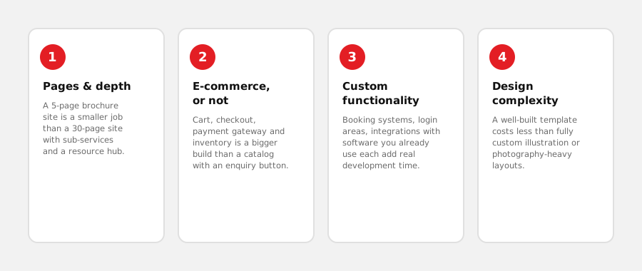
- Number and depth of pages. A 5-page site (home, about, services, portfolio, contact) is a fundamentally smaller project than a 30-page site with deep service sub-pages, a blog, and a resource library.
- E-commerce, or not. Adding a working cart, checkout, payment gateway integration, and inventory tracking is a different scale of build than a catalog page with a "call to enquire" button — see our e-commerce website design page for what that build actually involves.
- Custom functionality beyond a template. Booking systems, member logins, integrations with software you already use, multi-language content — each of these adds real development time a standard template doesn't need.
- Design complexity. A site built from a well-executed existing template costs less than fully custom design work, illustration, or photography-heavy layouts. Neither is wrong — it depends on what your brand actually needs.