
In depth: E-commerce Website Design in Pune
Why most "online store templates" don't actually sell
Drop any product into a generic e-commerce theme and technically you have a store — a homepage, some product cards, a cart icon in the corner. What you often don't have is a store that converts a browser into a buyer, and that gap is almost never a technology problem. It's a design problem, and it usually comes down to the same handful of mistakes: too many steps between "I like this" and "I paid for this," product pages that answer questions the seller cares about instead of the ones the buyer is actually asking, and a mobile experience that was clearly designed on a laptop and shrunk down as an afterthought.
Design, for an online store, isn't decoration. It's the sequence of decisions a visitor makes without thinking about them consciously — where their eye goes first, whether "Add to Cart" is where their thumb already is, whether they trust what they're looking at enough to hand over a card number. Get that sequence wrong and no amount of product photography fixes it. This is exactly where it connects back to website design more broadly — an online store is a website first, with a purchase flow layered on top, not a separate discipline.
What we actually pay attention to
Product and category pages come first, because that's where most of the actual browsing happens — not the homepage. A category page needs to let someone scan, filter, and compare quickly, without forcing them to click into ten product pages just to see prices. A product page needs the information a real buyer wants before they'll commit: clear pricing, honest stock status, sizing or variant options that are obvious rather than buried in a dropdown, and images that show the product the way it'll actually look, not just the way it looks in a studio.
The checkout flow gets a disproportionate amount of attention relative to how little screen space it occupies, because it's where most stores quietly lose sales. Every extra field, every forced account creation, every unclear shipping cost that only shows up at the last step — each one is a chance for someone to close the tab. We design checkout to ask for the minimum that's actually needed, show costs early rather than as a surprise, and make guest checkout genuinely available rather than technically possible but buried behind a login wall. A simplified version of the flow we design toward looks like this:
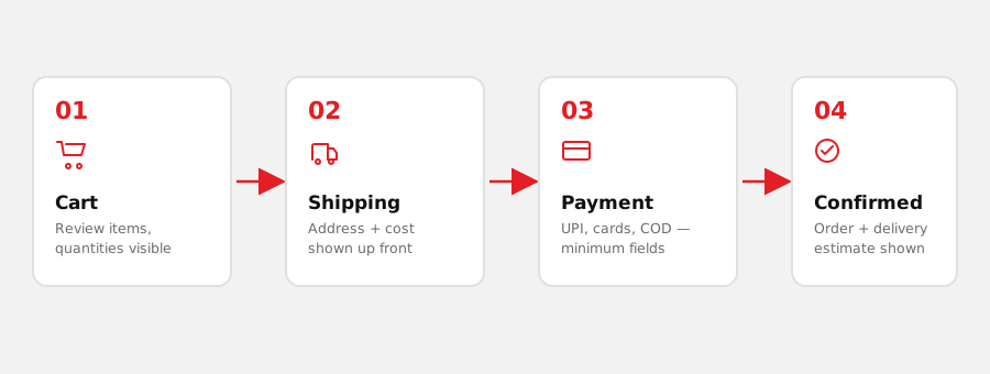
And then there's mobile, which for most Indian e-commerce traffic isn't a "consideration," it's the majority of the traffic. A layout that works on mobile first and scales up to desktop behaves very differently from one designed for a wide screen and squeezed down later — buttons sized for a thumb instead of a cursor, product images that load fast on a variable connection, a cart that's reachable in one tap rather than buried in a menu.
- Category pages — filterable, scannable, priced clearly without a click-through
- Product pages — real stock status, honest variant availability, images that match reality
- Checkout — minimum required fields, shipping cost shown before the last step, guest checkout genuinely available
- Mobile layout — designed first for a thumb and a mid-range phone, not shrunk down from desktop
Design and the build aren't really separate
A store design that looks right in a mockup but ignores what the underlying cart, payment gateway, and inventory system can actually do tends to fall apart the moment it goes live. That's why we treat design and e-commerce development as one conversation, not a handoff — the visual design accounts for how variants, discounts, out-of-stock states, and payment options actually need to behave, instead of designing an idealized version that then has to be renegotiated during the build.
A store design that hasn't been checked against the real cart and payment logic is a mockup, not a plan.
| Design decision | Why it matters at checkout |
|---|---|
| Guest checkout available | Forced account creation is one of the most common reasons a cart is abandoned. |
| Shipping cost shown early | A cost that only appears at the last step reads as a surprise, not a fee. |
| Minimum required fields | Every extra field is one more reason to stop filling in the form. |
| Clear stock & variant status | Selling something that turns out to be unavailable damages trust immediately. |